Sunday, March 1, 2015

Navigation button

Week 6

Research on Navigation Button.
"How" they display the navigation button?
  • The navigation buttons should appear along the left-side of pages. Other than that, display of the navigation button is placing it horizontally along the top of the pages.


"Why" they need the navigation button? 

  • The navigation button is to help the users find their way around or navigate through a site to find what they want.
"When" they need navigation button?
  •  The navigation button is needed when users use it for directly linking to a page or website rather than typing it in the address bar.


2.  Can navigation button to be complicated or simple design?

The design of navigation buttons should be simple because simplicity is a good thing. Navigation is one of the most important aspects of a web design but it doesn't mean it needs to be complicated or overly designed. Simplicity helps to better website readability and  make navigation faster and easier. It can be confusing for users when the navigation button are too complicated. Furthermore, it is also more user friendly and convenient.


Analogous colour


   The process of painting analogous colour


The final results


Tone and shade colour


The process of painting the tone and shade colour


    Final results


Thursday, February 26, 2015

Complimentary colour


  The process of painting the complimentary colours


                                          The final results


Monday, February 9, 2015

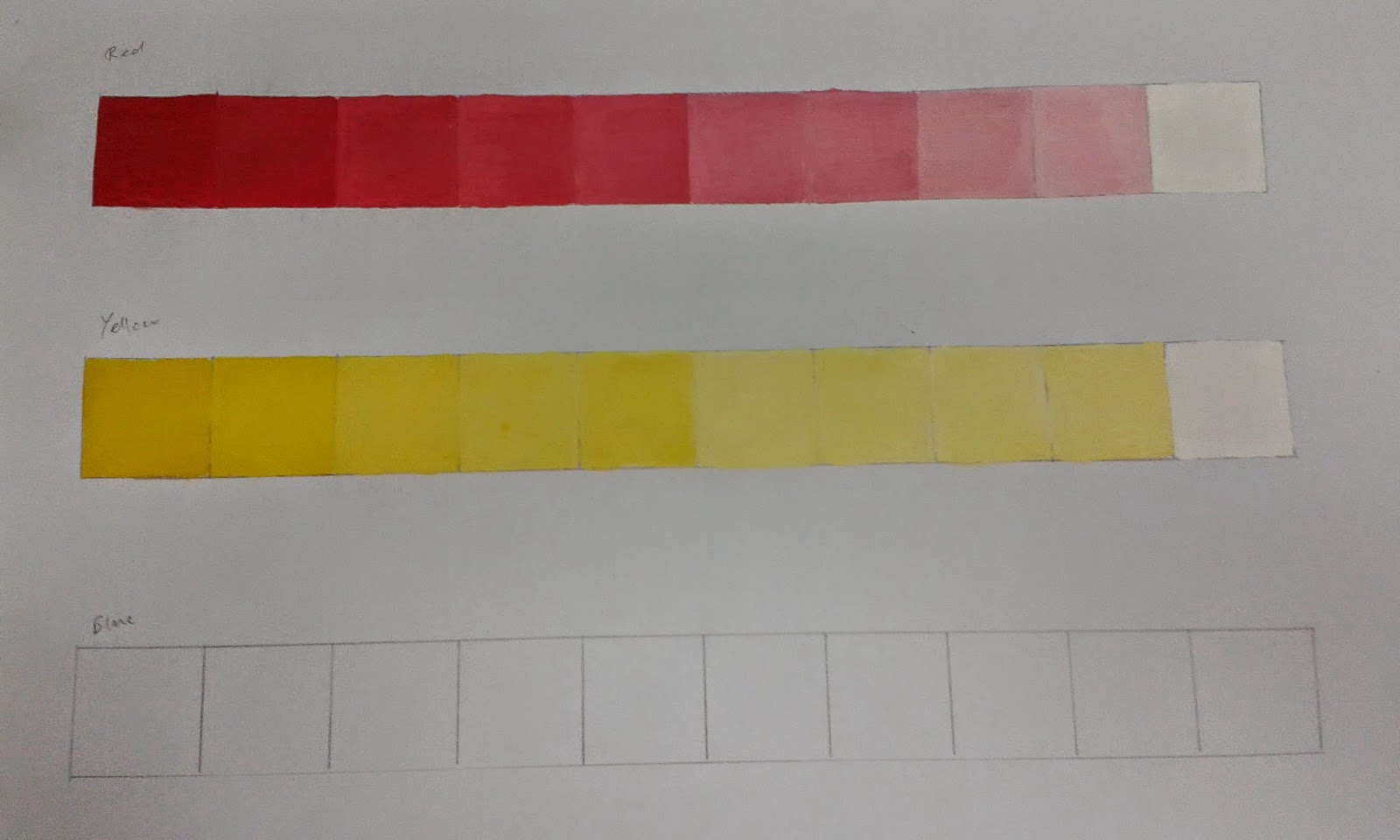
Tint and tone colour

                                          Practice


                                        Process of painting the tint colour


                                         Process of painting the tone colour


                                          Final results

Tint colour 


Tone colour

Colour wheel


                                          Final results 

Labeled the colours accordingly

Sunday, February 1, 2015

Visual usability

Week 3

1. What is the visibility space in the interface  

The meaning of the visibility space in the interface is to guide users through an interface and a series of tasks. Visibility is the clarity of the vision for a user to see the state of the interface and other possible actions. Furthermore, it is to tell users what interactions which are available and that can be used. 

2. Percentage of the usability interface

Many change requests on the usability interface has slowed down development time due to user interface and user experience. Approximately half of the developers believe that 25 to 75 percent of their work receive change requests that effect the user interface. At least 40 percent of developers said that 25 to 50 percent of additional development effort to tackle change requests. Other than that, a third believe it needs 50 to 100 percent more more attempt for development projects. Lastly, almost 5 percent said change requests more than double the original development effort needed.

Moreover, according to a survey 70 percent users supports the use of bitmap screens and 16 percent supported character terminals. Another 13 percent supported both. Furthermore, 73 percent of the applications used multiple windows in their interface and 57 percent used only overlapping windows. Another 20 percent used only tiled windows  and 22 percent used both kinds. 84 percent of the applications used menus that were popular even with applications not using a mouse.

3. How many users prefer the navigation icons on the right top/left top/center/bottom?

According to a survey, approximately 2.55% users prefer the navigation icons on the right top while there is around 2.04% of users who prefer using the left bottom  navigation icons. Other than that, 0.43 percent of users prefer it in the center of the display screen and 0.16 percent of the users prefer the navigation buttons at the bottom of the display screen.